Brand Concept: Building the 'Nuvola' Identity
The work began before any identity element was touched. We structured a Discovery Session that mapped the brand's target audiences through primary research: a quantitative survey across two profiles (Male British and Female British, both 25–44) combined with a series of Image World exercises that tested audience responses across four axes: contemporary versus traditional Italian imagery, slow food versus fast food associations, home-made versus food science frames, and urban versus rural contexts. The findings were specific enough to drive every subsequent decision. Traditional Italian imagery carried the strongest emotional response when specific and non-generic. "Fast serving, slow cooking" was the precise positioning sweet spot. Lightness in food had to feel like an abundance of care, not an absence of substance. No brand element was designed without a direct line back to one of these research conclusions.
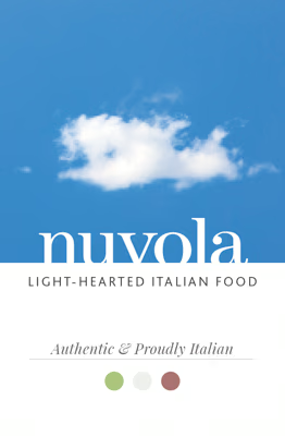
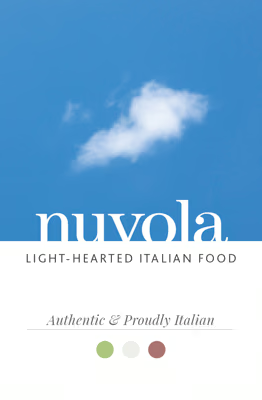
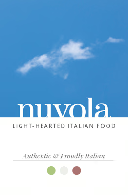
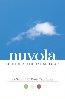
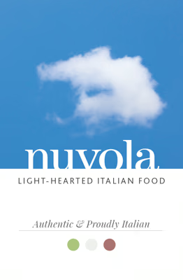
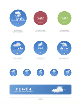
The name Nuvola, meaning cloud, was the first concrete outcome: a single word that carried lightness without clinical associations, Italian heritage without cliché, and an inherent visual flexibility through a metamorphic cloud symbol that changed form across every application. I developed the logotype from ITC Century Bold with custom modifications: legible, warm, and quietly authoritative. The colour system positioned sky blue as the dominant register, open, Mediterranean, and contemporary, set against warm earth tones. From this core, we extended the brand across a complete set of touchpoints: stationery, adhesive labels for handmade products, in-store posters with food photography styled and shot in-house, staff uniforms carrying typographic word clouds, and artistic wall lettering. One wall carried a quote from Italo Calvino, anchoring the brand to one of Italy's great literary intelligences without naming Italy once.
The spatial design, food photography, responsive web presence, and window display graphics were designed as a single connected system rather than a sequence of applications. Every surface carried the same semiotic contract: authentic Italian heritage expressed through contemporary lightness, with quality visible in the craft of every element. The brand did not describe the food. It created the environment in which the food's qualities became self-evident, and in which a London office worker, with thirty minutes to spare, could understand exactly what this place was for and why it was worth their time.

British Male — survey profile.
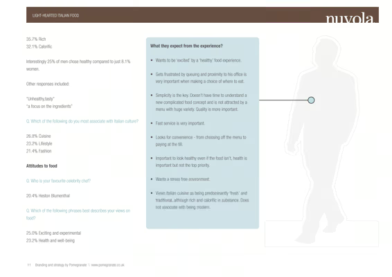
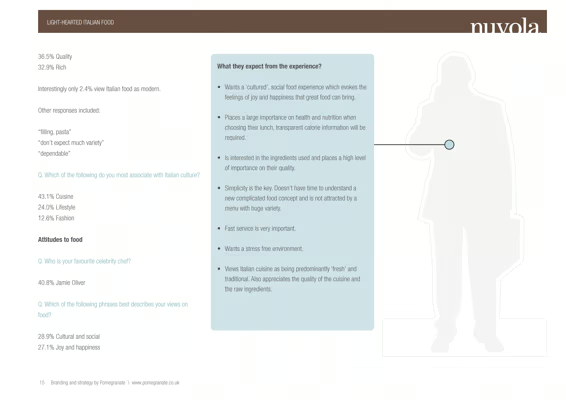
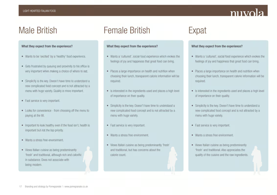
British Male — expectations.
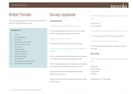
British Female — survey profile.
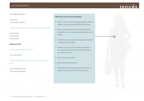
British Female — expectations.
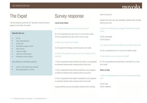
The Expat — survey profile.
The Expat — expectations.
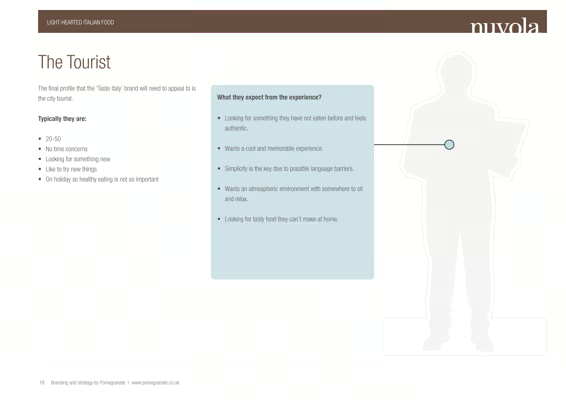
The Tourist — survey profile.
Three profiles — one brief.
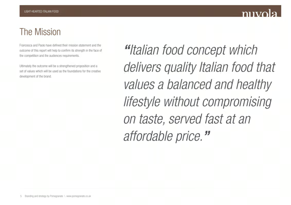
The mission statement.
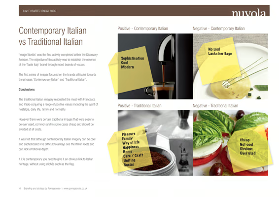
Contemporary vs Traditional Italian.
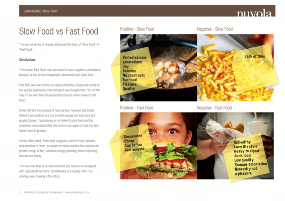
Slow Food vs Fast Food.
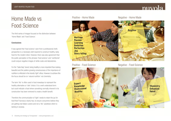
Home Made vs Food Science.
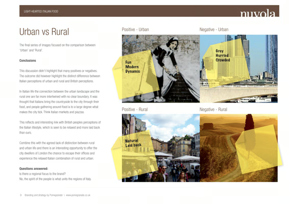
Urban vs Rural Italy.
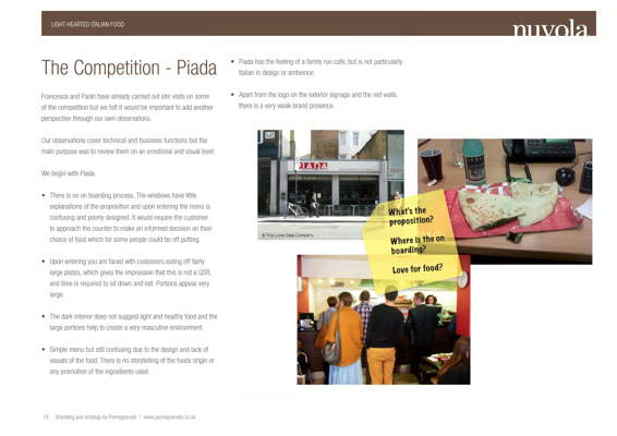
Competitor audit — Piada.
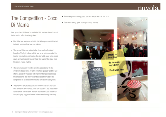
Competitor audit — Coco Di Mama.
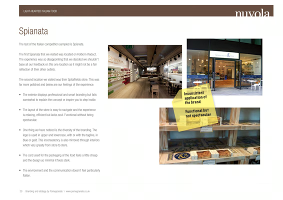
Competitor audit — Spianata.
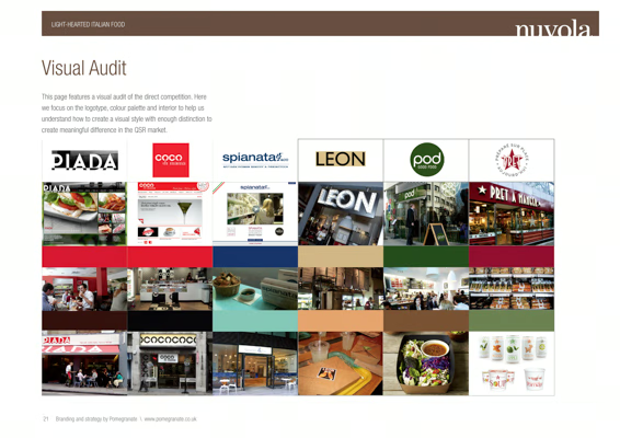
Visual audit — six brands.
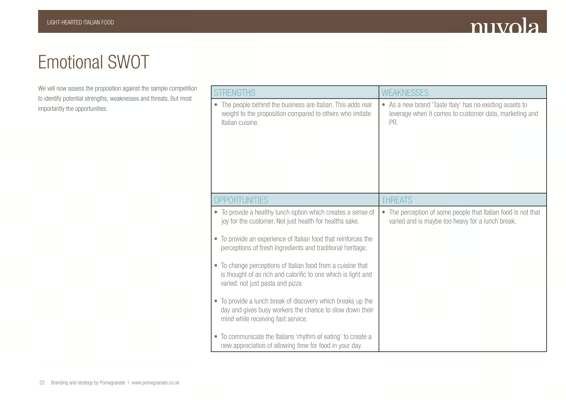
Emotional SWOT analysis.
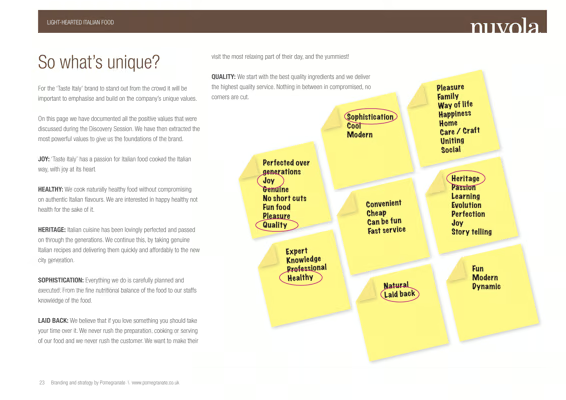
So what is unique?
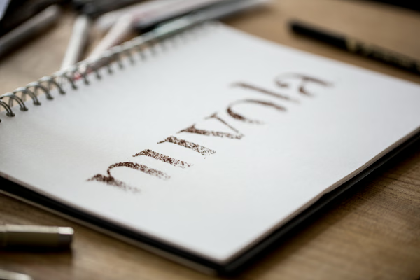
Name — first pencil sketch.
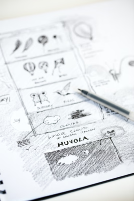
Symbol — early ideation.
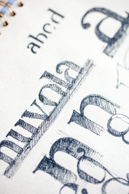
Typeface — letterform studies.
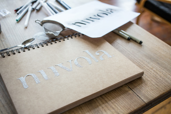
Logotype — proofing in progress.
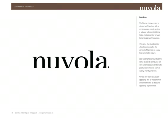
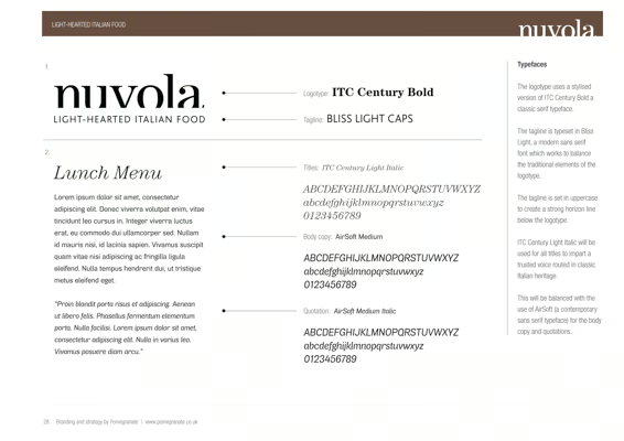
Logotype — rationale.
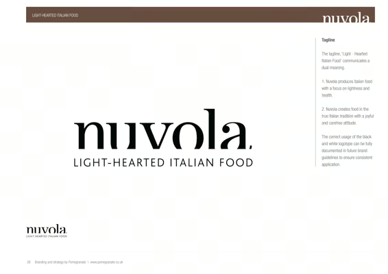
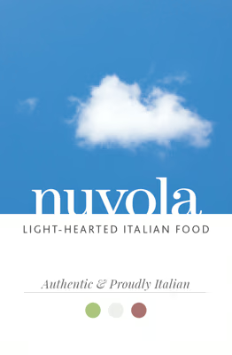
Tagline — Light-Hearted Italian Food.
Full typography system.
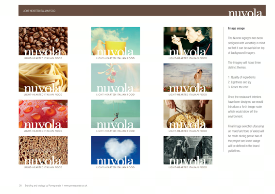
Image usage — three registers.
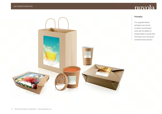
Packaging — full set concept.
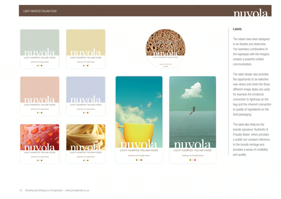
Labels — eight variants.
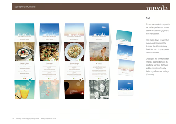
Menus — four daypart formats.
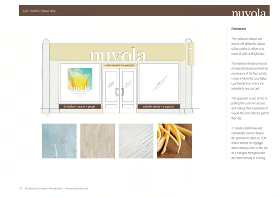
Exterior — concept render.
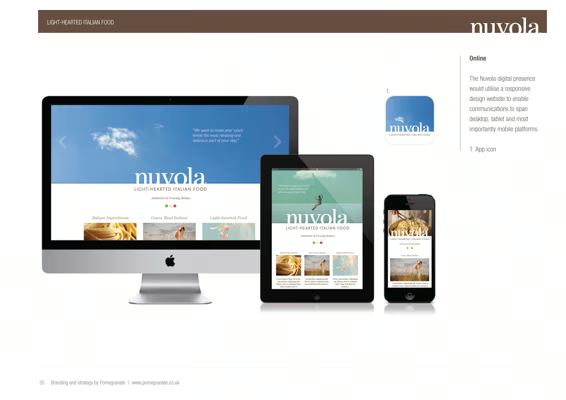
Digital — responsive concept.
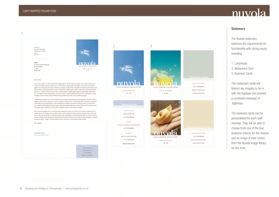
Stationery — full set concept.
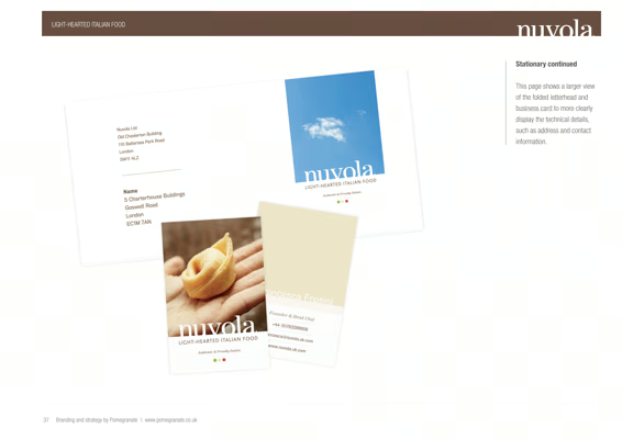
Stationery — detail.
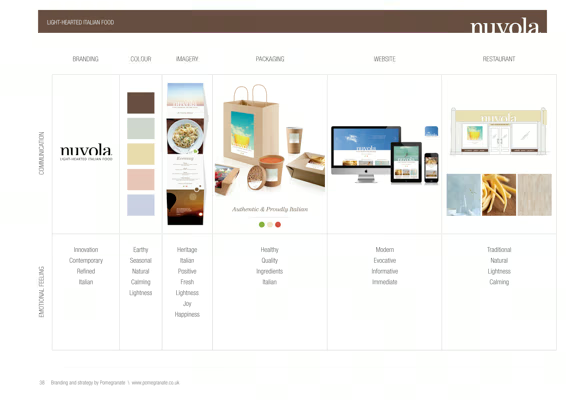
Brand overview matrix.
Logo — specification sheet.
Logo — construction grid.
Cloud symbol — eight formations.
Logo — natural environment.
Brand voice — full type system.
Word cloud — coffee and pasta.
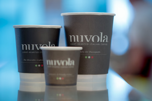
Coffee cups — three sizes.

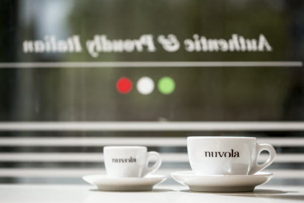
Espresso cups — window reflection.
Label — variant 01.
Label — variant 02.
Label — variant 03.
Label — variant 04.
Label — variant 05.
Label — variant 06.
Label — variant 07.
Label — variant 08.

Stationery — printed production.
Label and fascia — full system.
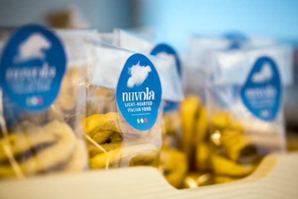
Pasta — label on packaging.
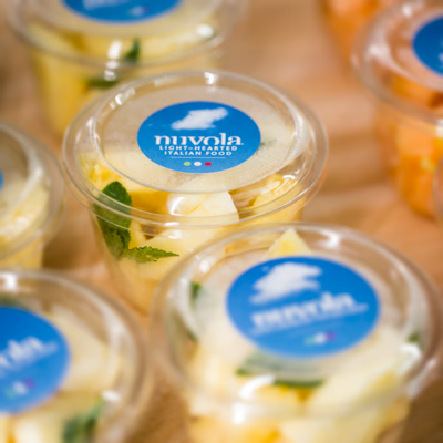
Fruit salad — circular label.
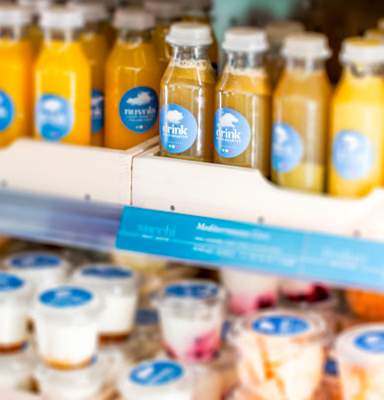
Drink — sub-brand label.

Juice bottles — drink label.
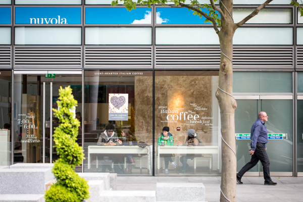
Store exterior — street level.
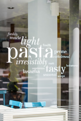
Window — pasta word cloud.
Wall lettering — early sketches.
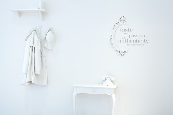
Wall — taste our passion.
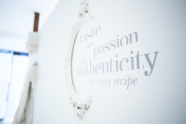
Wall lettering — ornate frame detail.
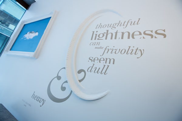
The Calvino wall.
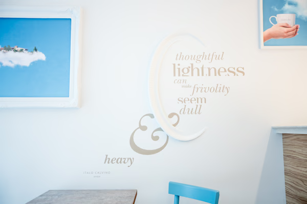
Calvino wall — in context.
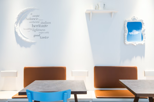
Brand values — word cloud wall.

Wall typography — close detail.
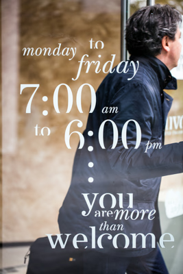
Window — opening hours.
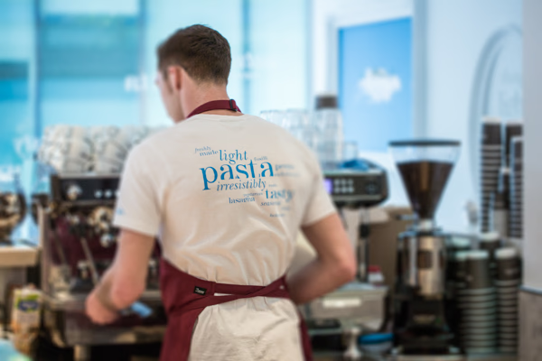
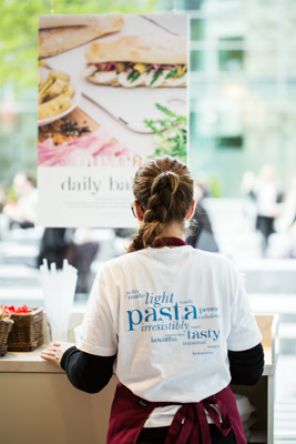
Uniform — pasta word cloud.
Cups — window lettering layered.
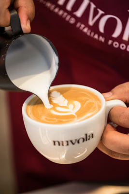
Coffee — latte art craft.
Uniform — in store context.
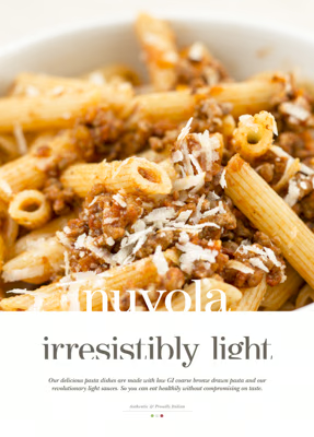
Pasta — irresistibly light.
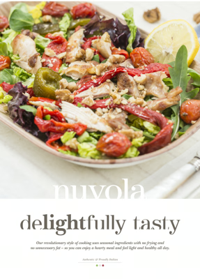
Salad — delightfully tasty.
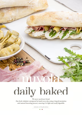
Bread — daily baked.
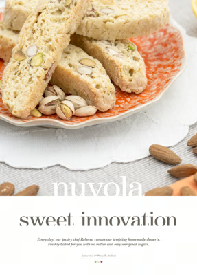
Desserts — sweet innovation.
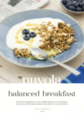
Breakfast — balanced.
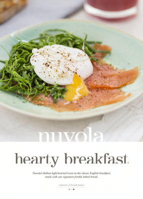
Breakfast — hearty.
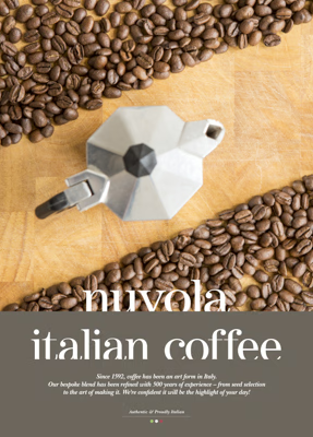
Coffee — italian.
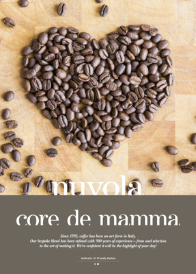
Coffee — core de mamma.
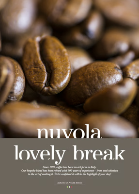
Coffee — lovely break.
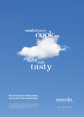
Brand — revolutionary cooking.
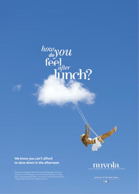
Brand — how do you feel after lunch?
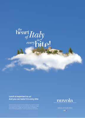
Brand — the heart of Italy in every bite.
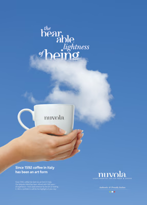
Coffee — the bearable lightness of being.