Service Design Strategy: Persona-Driven Bundle Architecture
The intervention began with customer journey mapping across the full SUNNERSTA acquisition path: from social discovery through landing page to checkout. Rather than auditing the product, I audited the experience of buying it. What the mapping revealed was not a single failure but a sequence of disconnections, each one transferring cognitive work that should belong to the platform onto the customer. The first decision was therefore not to redesign a page but to redesign who carries the burden of compatibility. The answer had to be: the system, not the buyer.
With a UX researcher and an interior designer, I then built four persona profiles mapped against real European living contexts: a London student in a bedsit (small space, minimal budget), a Paris artist in a studio (small space, flexibility first), a Madrid family mid-renovation (temporary set-up, plug-and-play priority), and a Berlin user fitting out a secondary space (extra functions, small budget). Each persona had a different compatibility matrix, a different emotional state at the point of purchase, and a different definition of what a complete solution looked like. The work was to pre-compute those matrices and embed them in the experience before the customer arrived.
The output was a three-layer digital architecture. Social channels were redesigned to route directly into persona-matched landing pages rather than single-product pages, turning inspiration into a directed entry point. Each landing page presented a pre-configured, one-click bundle validated for that specific context, with every mandatory component included and every accessory relevant to that use case offered as a clear upsell. The catalogue ceased to be the interface. The bundle became the interface. Web, social, and the complete bundle checkout were designed as a single connected system, not three separate surfaces.

Sunnersta — the full system.
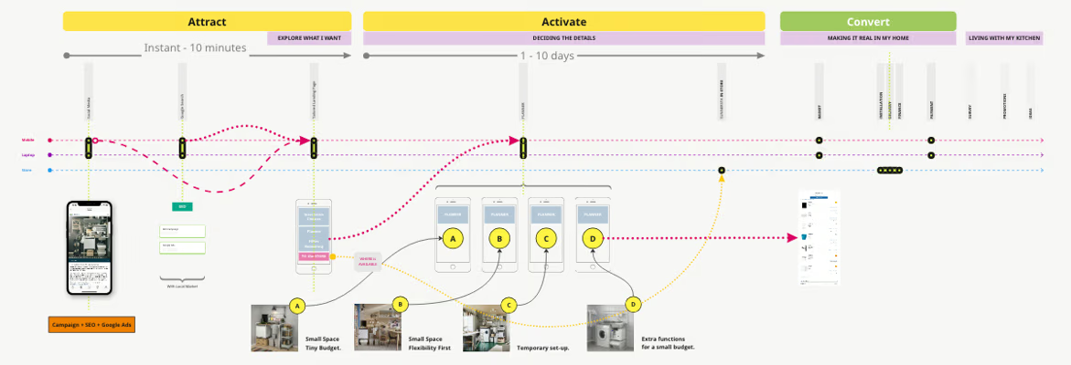
Omnichannel journey — three phases.
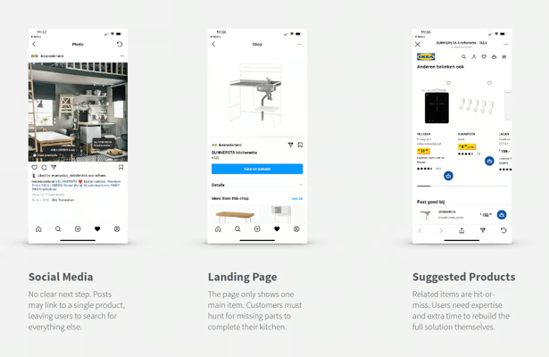
Baseline — three digital failures.
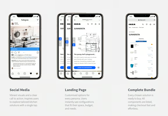
Prototype — one connected flow.